Forum for discussing general topics related to Couch.
6 posts Page 1 of 1
Hi,

Is there a global way to colour-theme Couch v2.0 and substitute a different gradient for the brown in the buttons and elsewhere? Or is it done item-by-item? Thanks!
Hi,
colours are right at the beginning of the main.css, so quite easy to alter..main.css could be found in couch\theme\_system\includes\admin

Image
Hi,

The following thread has some more info - viewtopic.php?f=2&t=10255&p=24787#p24787

Also, as shown in the mentioned thread, instead of directly changing the core css file, it is recommended to do so by overriding it using your custom theme. This way your changes won't be overwritten during future upgrades.

Hope it helps.
Hi KK thanks for the advice. I did look through your thread. Awesome job on the documentation by the way!

I have one small question : you mentioned that templates could be grouped in the sidebar, and you showed how this could be done. I will be doing this for the languages in my client's site.

Can I rename/repurpose the "Templates" section into say "English", and then just create a "French" section, thus having two groups of templates? Or is the "Templates" section fixed? Because for my purposes it will be empty.
Can I rename/repurpose the "Templates" section into say "English"
Sure! In fact, the procedure to do so is mentioned right there in the same docs, I am quoting from which -
At this point it might cross your mind - how to change the title of the two default menu-groups?
We could do that using some PHP code in kfunctions.php but I think you'd find it easier to do so by editing the 'couch/lang/EN.php' file where you'll find their texts listed as -

$t['menu_templates'] = 'Templates';
$t['menu_modules'] = 'Administration';

Rename the 'Templates' to 'English' in the indicated language file and create the 'French' group as a custom one.

Hope it helps.
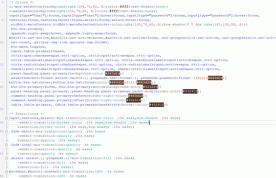
Quickest way for me was to create styles.css (or add CSS below to your existing one) in your theme folder:

Code: Select all
.btn.btn-primary, .append>.login-swap:hover, .append>.login-swap:focus, #nav>li>.nav-active, #nav>li>.nav-active:hover, #nav>li>.nav-active:focus, .nav-group>ul>li>.nav-active, .nav-group>ul>li>.nav-active:hover, .nav-group>ul>li>.nav-active:focus, .nav-count, .gallery-img-link.gallery-img-folder, .btn-menu.toggled, .table.table-primary>thead, .ctrl>input:checked+span.ctrl-option, .ctrl>input:active+span.ctrl-option, .ctrls-checkbox>label>input:checked+span.ctrl-option, .ctrls-checkbox>label>input:active+span.ctrl-option, .ctrls-radio>label>input:checked+span.ctrl-option, .ctrls-radio>label>input:active+span.ctrl-option, .checklist>li>label>input:checked+span.ctrl-option, .checklist>li>label>input:active+span.ctrl-option, .panel-heading.panel-primary {
    background-color: #6fc624;
}

.btn.btn-primary:focus, .btn.btn-primary:active {
    background-color: #61AB20;
}

input[type="text"]:focus, input[type="text"]:hover:focus, input[type="password"]:focus, input[type="password"]:hover:focus, textarea:focus, textarea:hover:focus, select:focus, select:hover:focus, .nicEdit-mainContain.nicEdit-mainSelected {
    border-color: rgba(88,158,28,.6);
    box-shadow: 0 0 4px rgba(111,198,36,.6);
}

.select>select:focus+.select-caret>.i, .prepend>.text:focus~.i, .prepend>.password:focus~.i {
    fill: #6fc624;
}


Explanation:
1. background of buttons and all colored elements
2. background of all active/focused elements
3. border and shadow of all hovered/focused elements
4. icon color of focused input field
6 posts Page 1 of 1